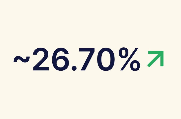
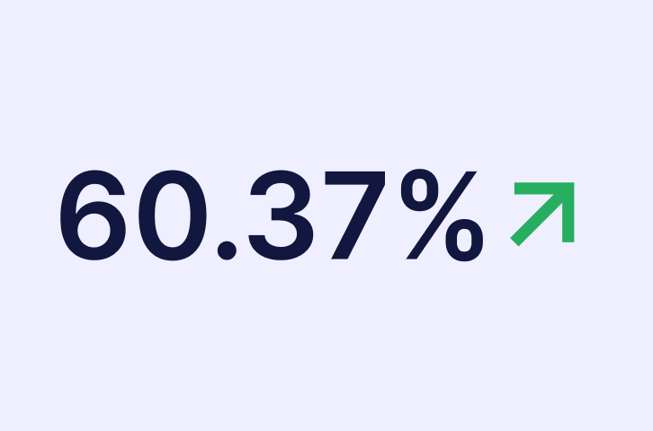
Increase in revenue
Before $27,087/month

Ecommerce
Web/Mobile

Revenue-Driven UI/UX Redesign
The project focused on transforming GoodRxMedicine from a transaction-heavy, text-dense pharmacy site into a more intuitive, human-centered digital experience. Through data-driven UX redesign, improved product discoverability, and simplified purchase flows, the revamp aimed to reduce bounce rates and improve user retention.
We found that most of the users who visit the website drop off from the product page and the current users are facing issues navigating the website.

Confusing navigation
The user used to struggle while visiting the website confused which was identified by the number of dead clicks on images, buttons and back and forth between pages until final checkout.

No data hierarchy
Lack of a clear hierarchy makes it challenging to analyse information effectively which leads to missed insights and gradually affects decision-making
Conducted in-depth user research to identify key pain points and areas for improvement in the journey, focusing on enhancing user experience and engagement.

User Research
1. Visited clarity video library to analyze user behavior.2. Analyzed the issues addressed on the customer support call regarding website.

Product Research

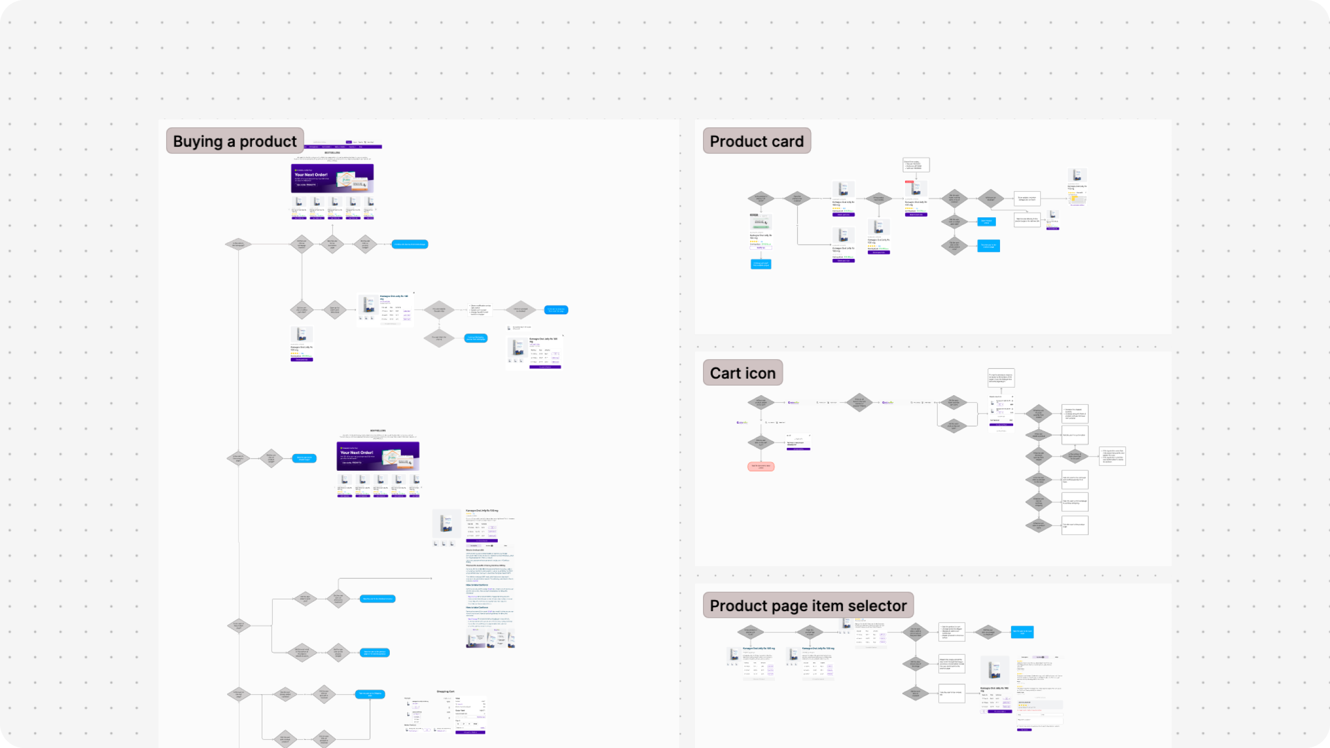
Mapping current user flows
Current user flows helped me identify places of improvement on how we can reduce the friction from when the user entering the page and then checking out

Exploring multiple user journeys
Exploring multiple user journey’s helped me identify on which user journey might work the best for us while addressing all the issues the users are currently facing
We first analysed the and then reworked on the current user flows to make sure we don’t miss out on any chance of improvement
Let’s admire now
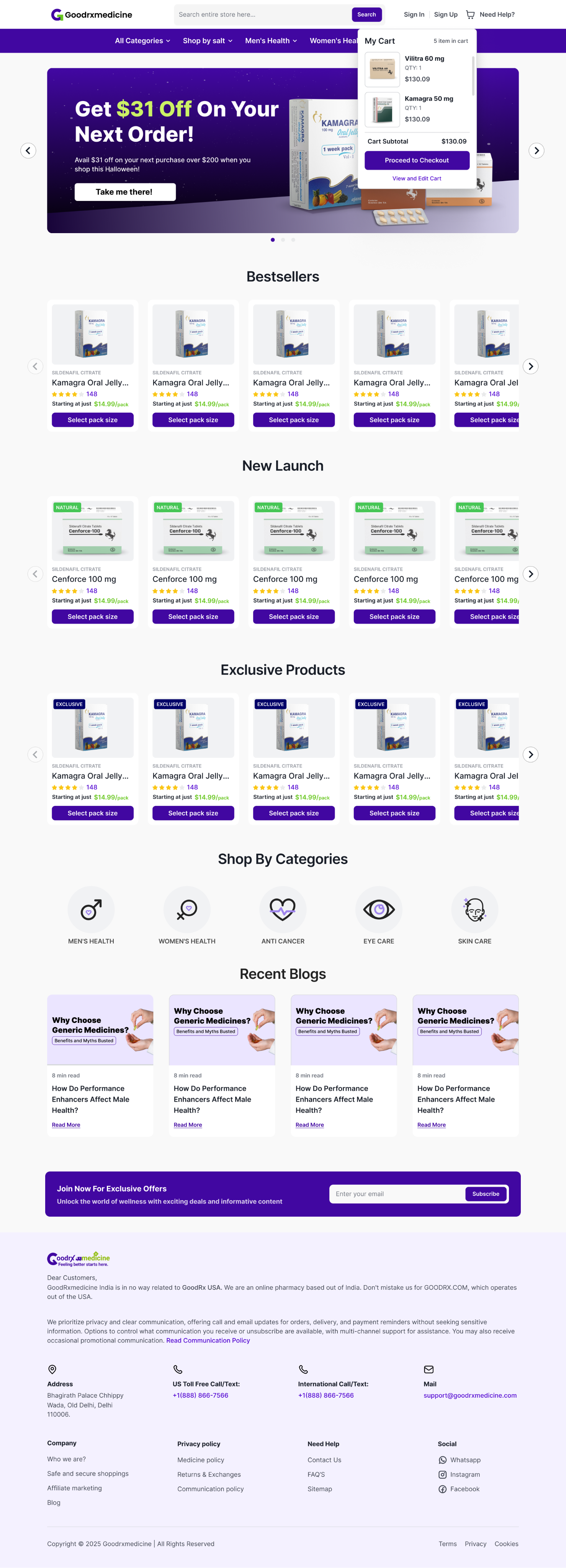
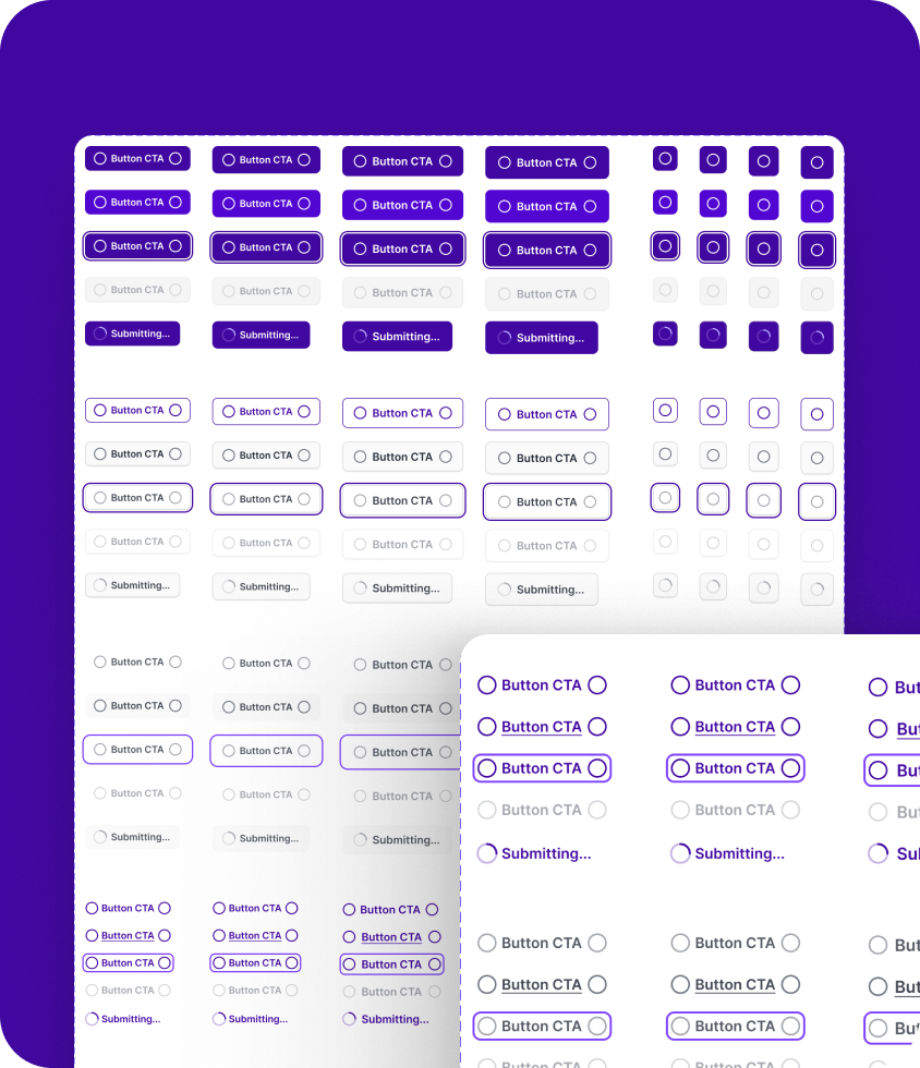
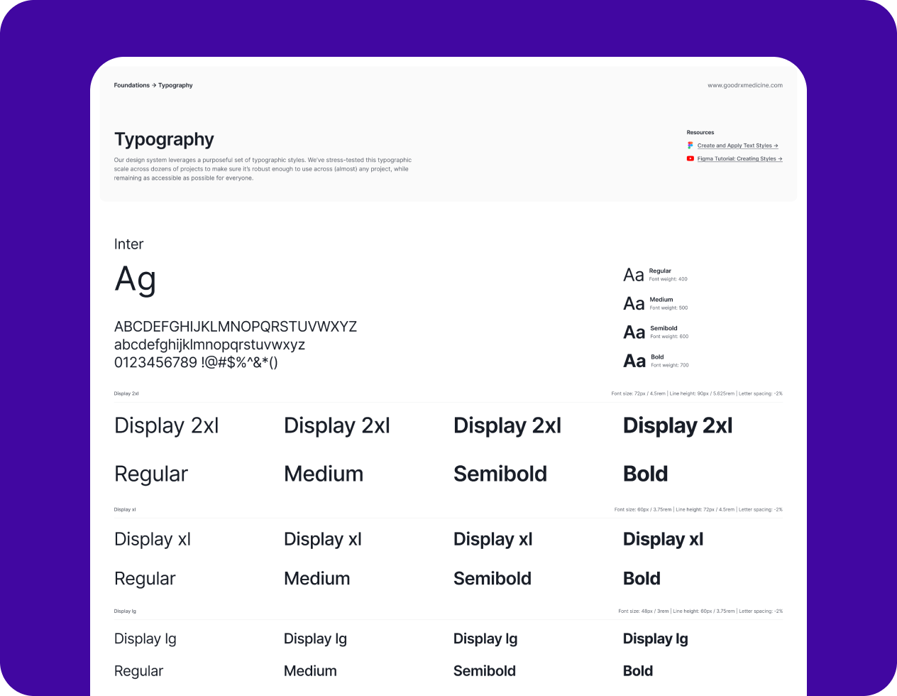
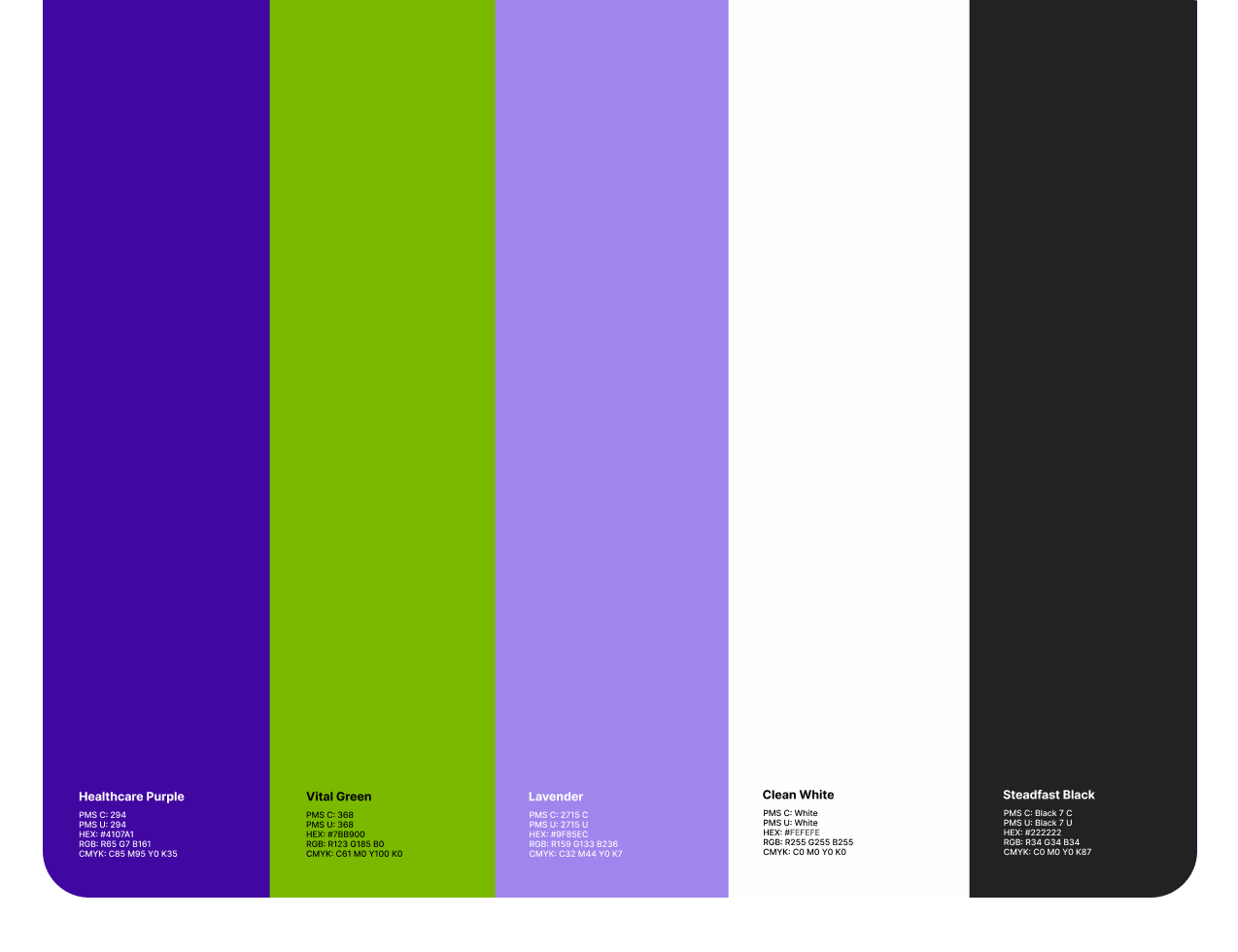
👉🏻 Full brand revamp via new brand guidelines.
👉🏻 New and consistent homepage banners for consistency.
👉🏻 Built a design system.
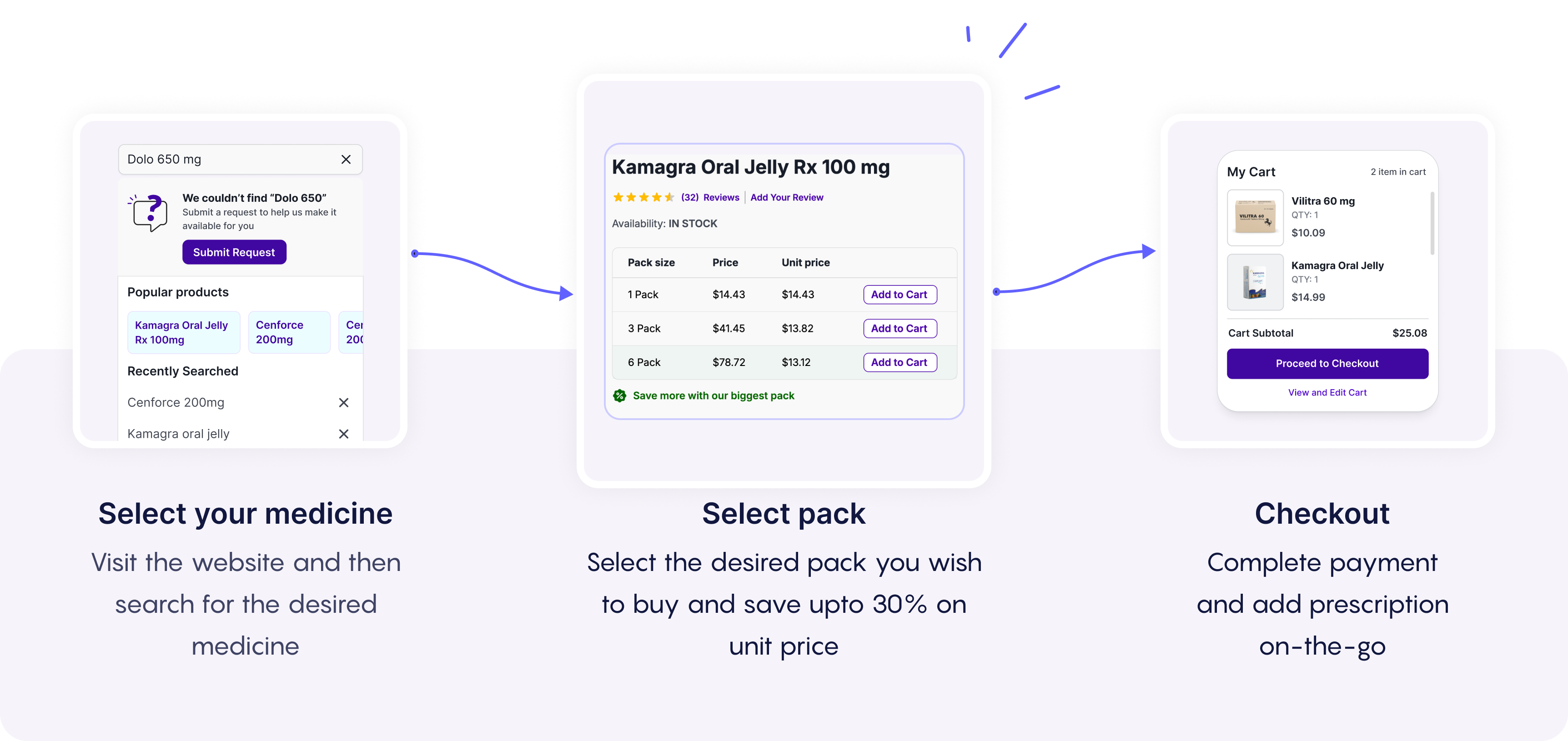
👉🏻 Clearer pricing on every page.
👉🏻 Number of clicks to checkout reduced.
👉🏻 New search user experience.
Let’s pinpoint improvements
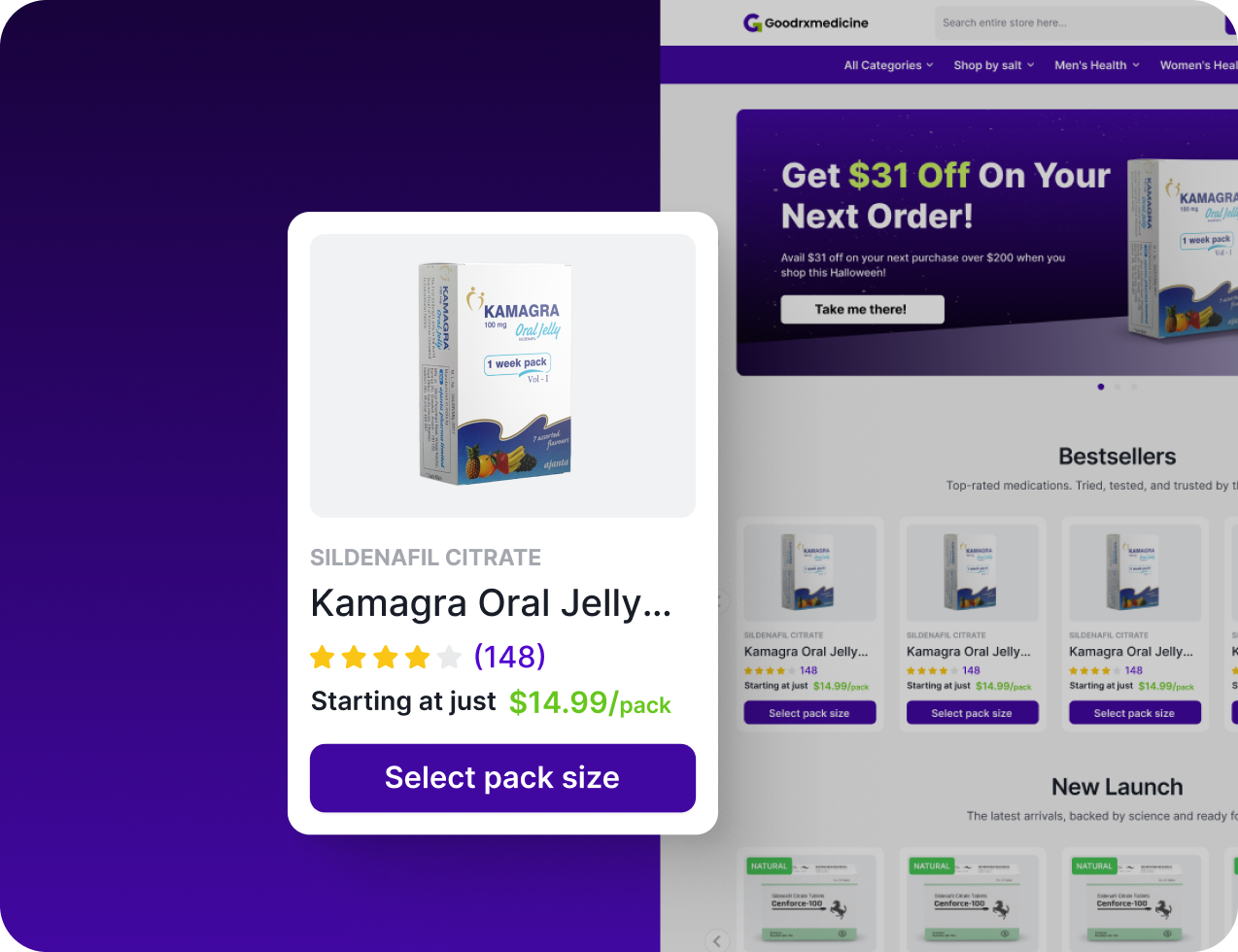
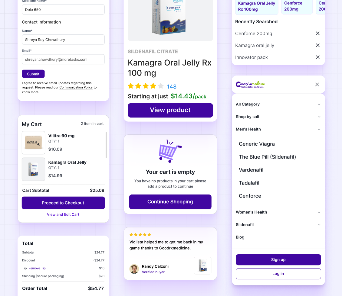
These changes not only made the product card visually appealing but accessible as well on both mobile and desktop.
👉🏻 Improved image mockups
👉🏻 Added salt name for every product
👉🏻 Viewers can now judge based on the number of ratings the product has received
👉🏻 Clearer pricing on every page
👉🏻 Clearer pricing
👉🏻 Introduced tags for sale, exclusive, bestsellers
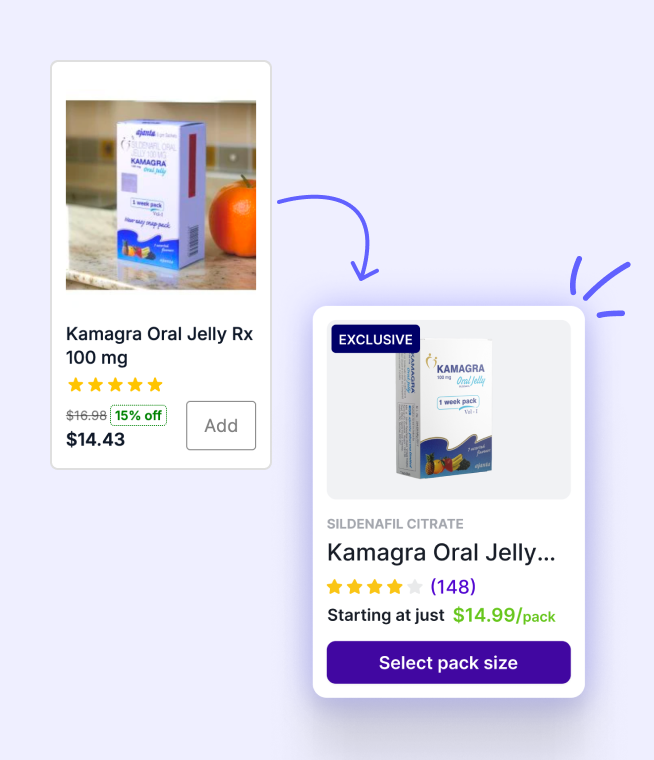
Most of these improvements helped us improve overall user experience site wide
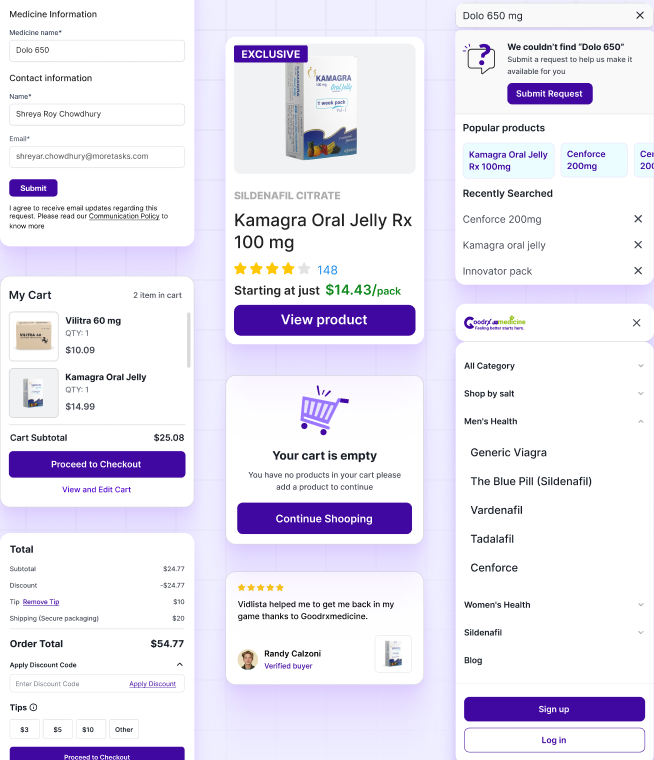
👉🏻 Mobile first redesign.
👉🏻 Overall journey from Homepage →Product page → Checkout.
👉🏻 Product search to get new products.
👉🏻 Viewers can now judge based on the number of ratings the product has received.
👉🏻 Clearer pricing
👉🏻 Introduced tags for sale, exclusive, bestsellers.
Before $27,087/month
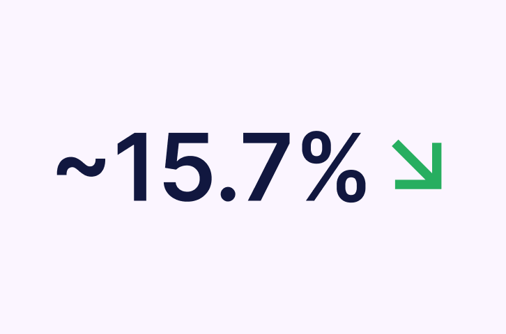
Before <10%
Before 25%
Star Key Learning
Cohesion drives conversion when the design system, UX flow, and content speak the same language, revenue follows.
From insights to interfaces, every design decision aimed to make GoodRxMedicine not just easier to use, but smarter, faster, and more human.
Result: A seamless buying journey that built trust and boosted revenue.
Ecommerce
Web/Mobile


Revenue-Driven UI/UX Redesign
The project focused on transforming GoodRxMedicine from a transaction-heavy, text-dense pharmacy site into a more intuitive, human-centered digital experience. Through data-driven UX redesign, improved product discoverability, and simplified purchase flows, the revamp aimed to reduce bounce rates and improve user retention.
We found that most of the users who visit the website drop off from the product page and the current users are facing issues navigating the website.
Confusing navigation
The user used to struggle while visiting the website confused which was identified by the number of dead clicks on images, buttons and back and forth between pages until final checkout.
No data hierarchy
Lack of a clear hierarchy makes it challenging to analyse information effectively which leads to missed insights and gradually affects decision-making
Conducted in-depth user research to identify key pain points and areas for improvement in the journey, focusing on enhancing user experience and engagement.

User Research
1. Visited clarity video library to analyze user behavior.2. Analyzed the issues addressed on the customer support call regarding website.
Product Research

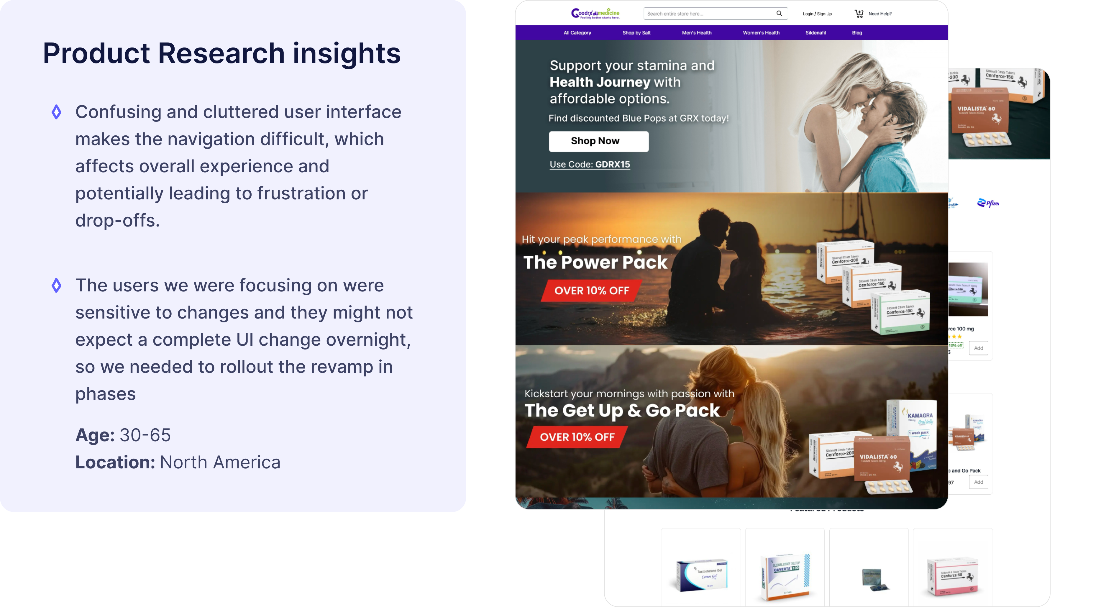
Navigation via categories always seemed like a challenge to the user as the categories section included best-sellers medicines and salt names of medicines.

The number of dead clicks on product images and frequent back and forth between pages stated navigational frustration.
The search queries suggested people are more habitual of searching via the salt name rather than the common name.
User had trouble trusting Goodrxmedicine as the UI seemed very dated.


Mapping current user flows
Current user flows helped me identify places of improvement on how we can reduce the friction from when the user entering the page and then checking out
Exploring multiple user journeys
Exploring multiple user journey’s helped me identify on which user journey might work the best for us while addressing all the issues the users are currently facing
We first analysed the and then reworked on the current user flows to make sure we don’t miss out on any chance of improvement
Let’s admire now
👉🏻 Full brand revamp via new brand guidelines.
👉🏻 New and consistent homepage banners for consistency.
👉🏻 Built a design system.
👉🏻 Clearer pricing on every page.
👉🏻 Number of clicks to checkout reduced.
👉🏻 New search user experience.
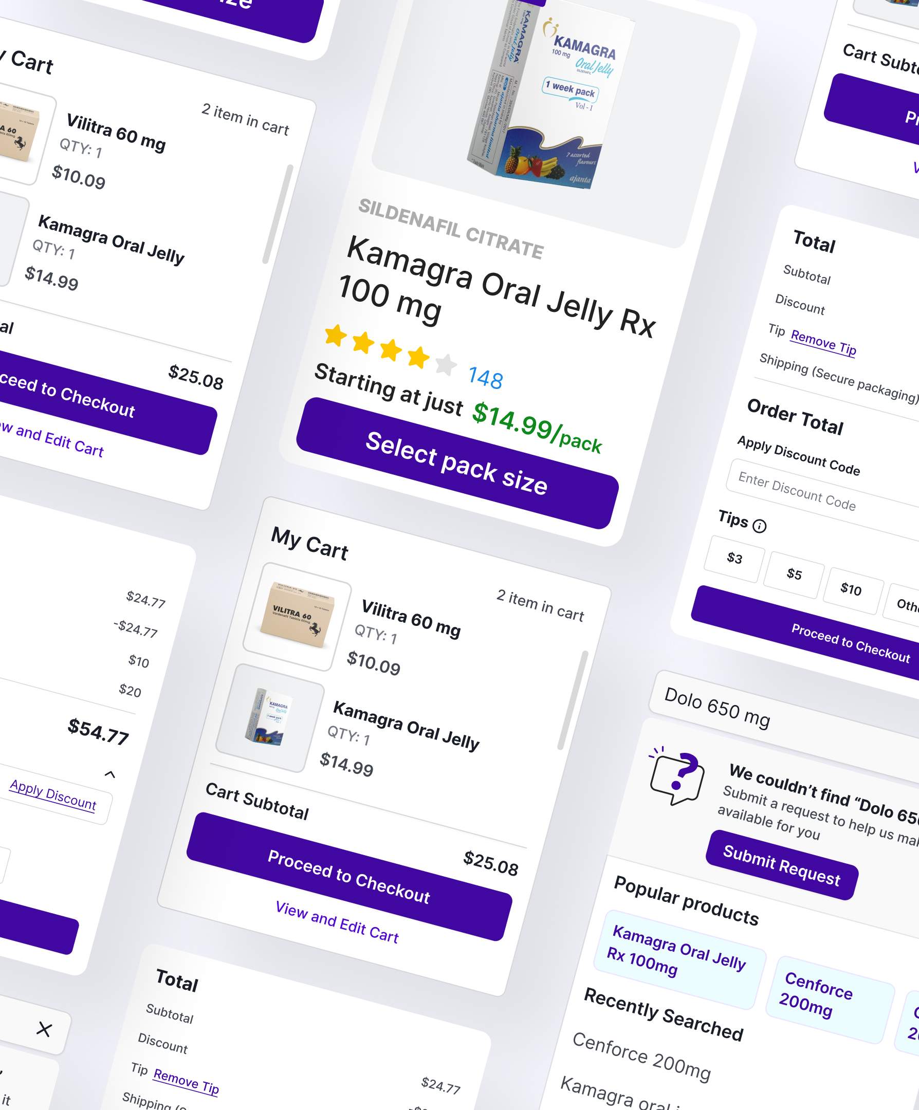
👉🏻 Introduced mini cart on hover.
👉🏻 Introduced product image guidelines.
👉🏻 Introduced new content guidelines to help the user trust us better.
👉🏻 Recommend related products on cart page.
👉🏻 And many more...
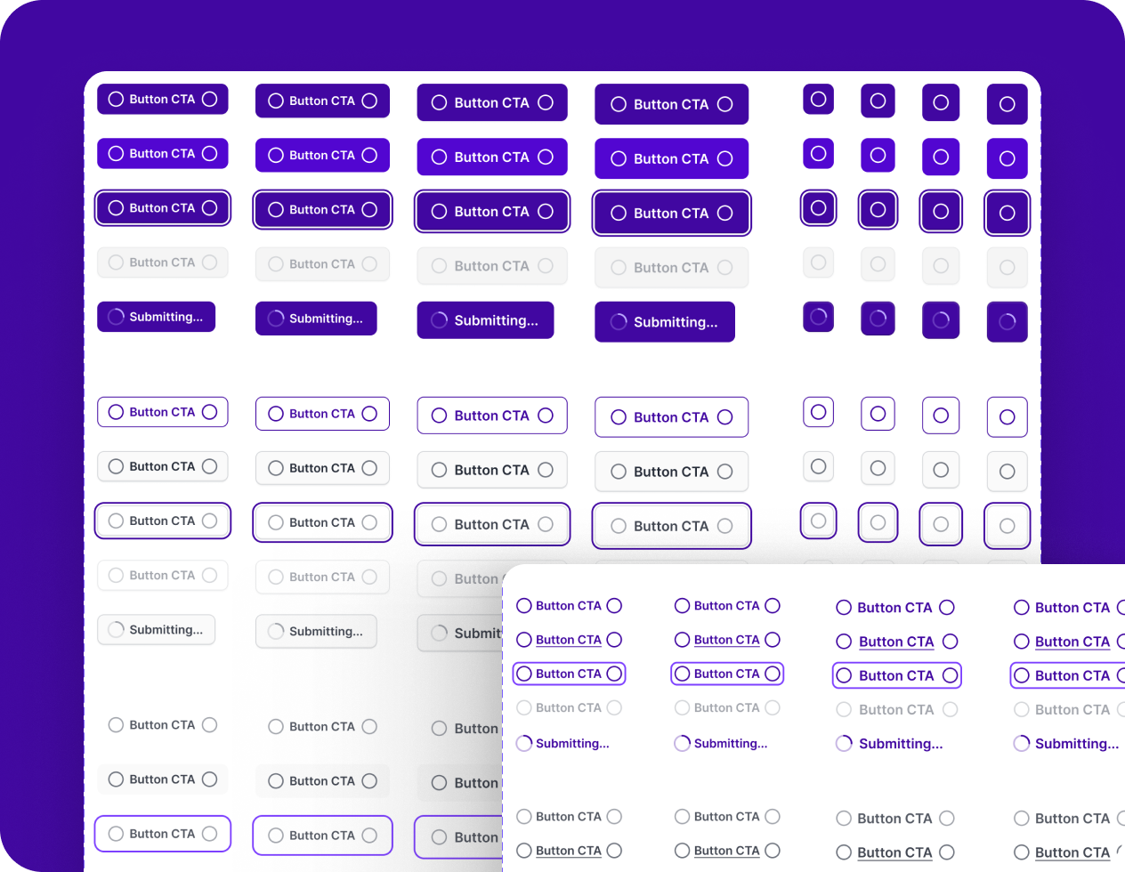
Let’s pinpoint improvements
These changes not only made the product card visually appealing but accessible as well on both mobile and desktop.
👉🏻 Improved image mockups
👉🏻 Added salt name for every product
👉🏻 Viewers can now judge based on the number of ratings the product has received
👉🏻 Clearer pricing on every page
👉🏻 Clearer pricing
👉🏻 Introduced tags for sale, exclusive, bestsellers
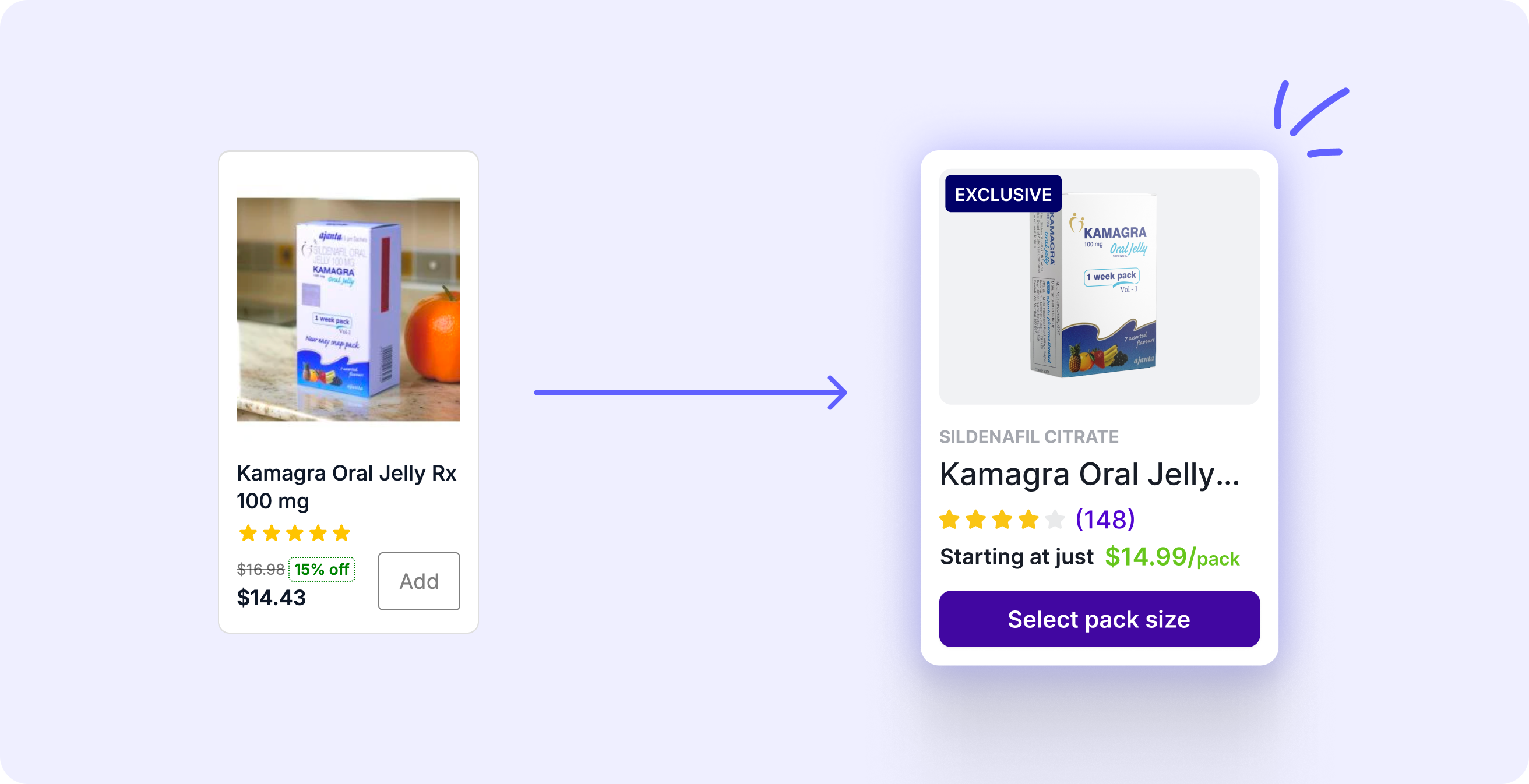
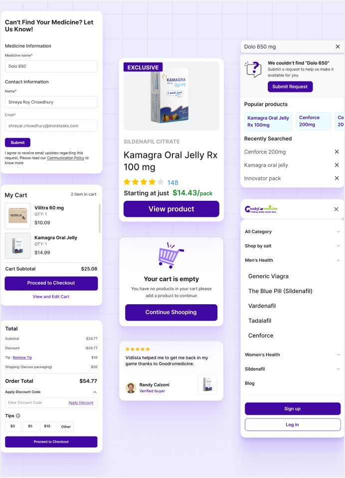
Most of these improvements helped us improve overall user experience site wide
👉🏻 Mobile first redesign.
👉🏻 Overall journey from Homepage →Product page → Checkout.
👉🏻 Product search to get new products.
👉🏻 Viewers can now judge based on the number of ratings the product has received.
👉🏻 Clearer pricing
👉🏻 Introduced tags for sale, exclusive, bestsellers.
Before $27,087/month
Before <10%
Before 25%
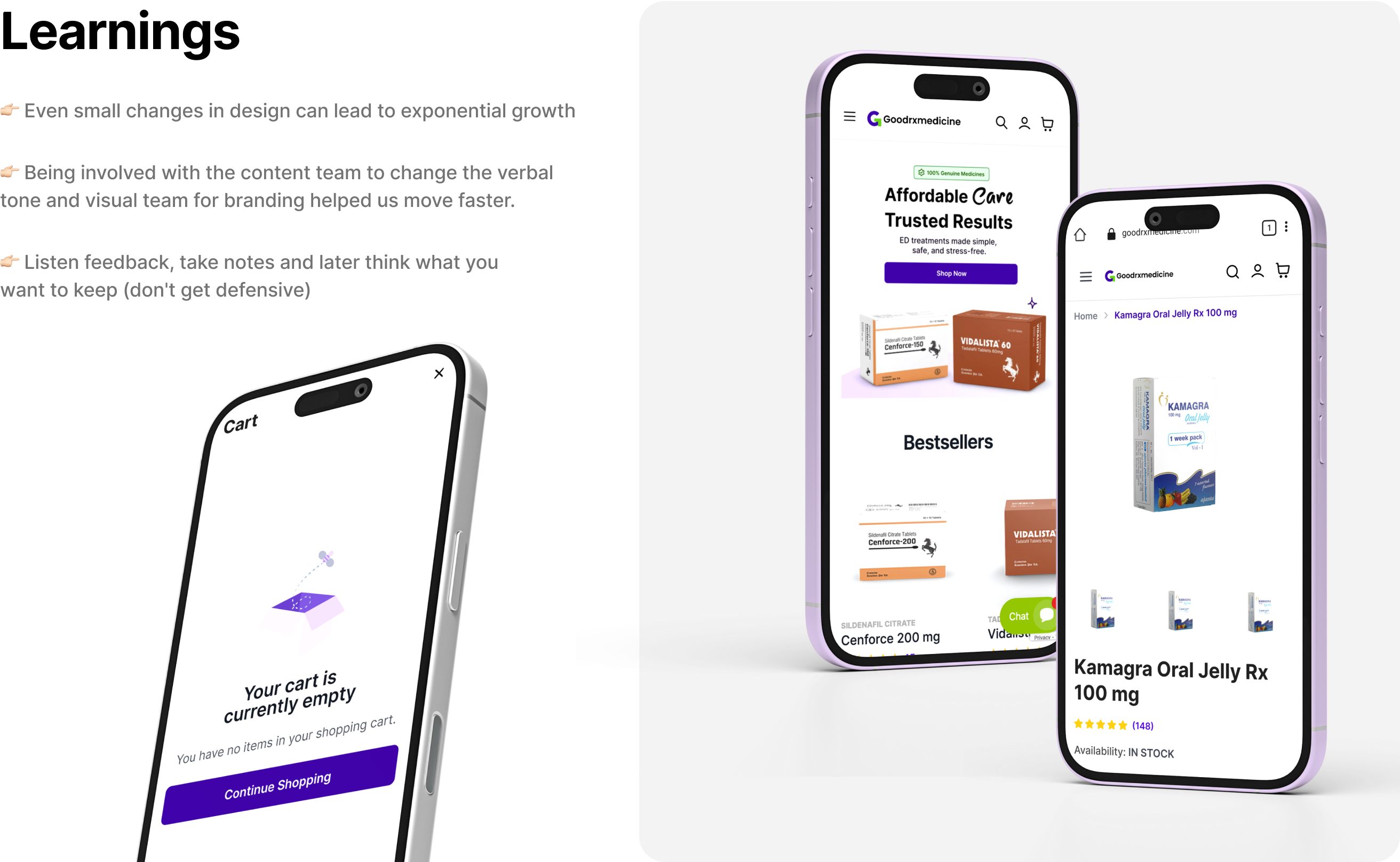
👉🏻 Even small changes in design can lead to exponential growth
👉🏻 Being involved with the content team to change the verbal tone and visual team for branding helped us move faster.
👉🏻 Listen feedback, take notes and later think what you
want to keep (don't get defensive)
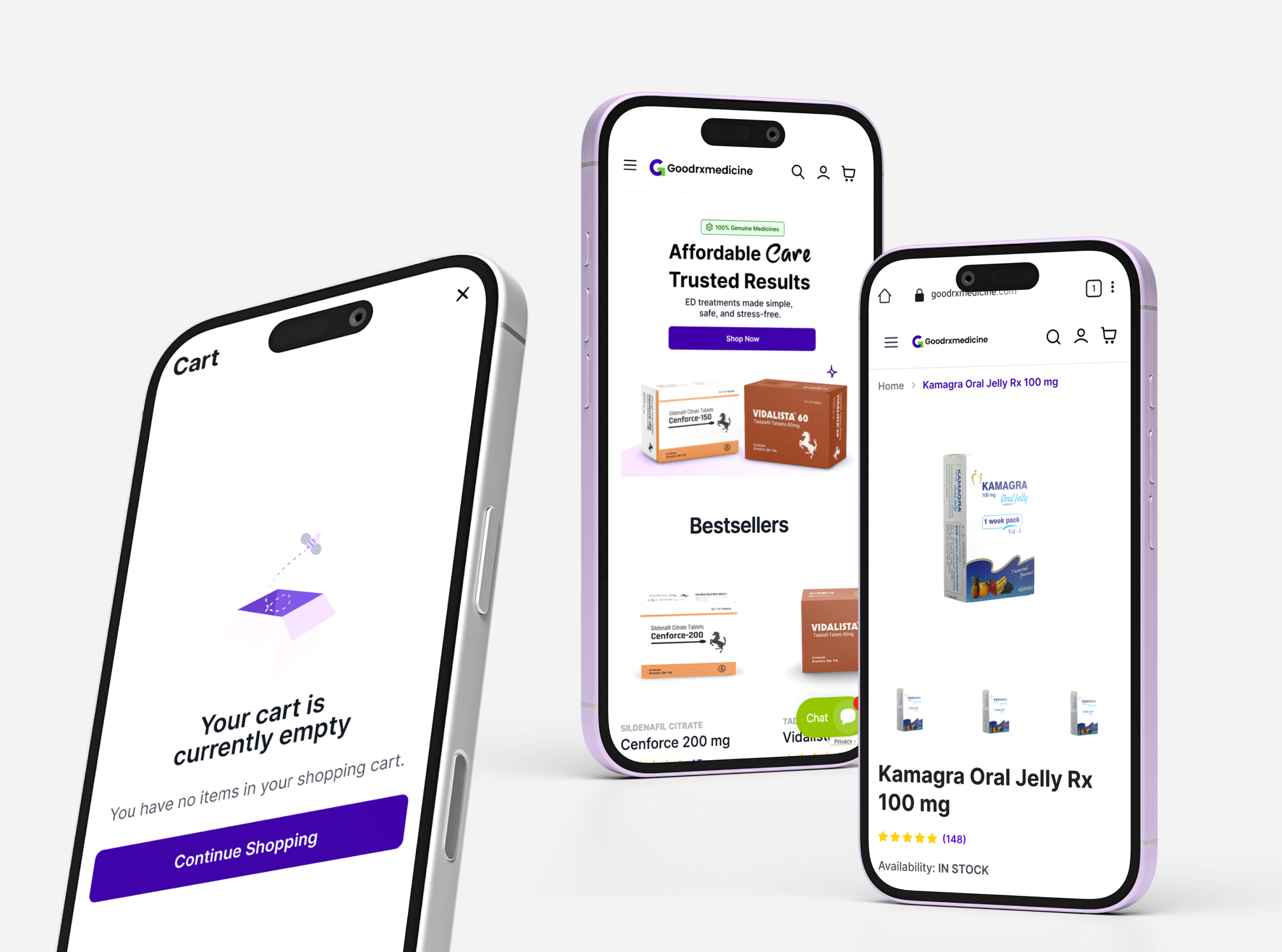
Star Key Learning
Cohesion drives conversion when the design system, UX flow, and content speak the same language, revenue follows.
From insights to interfaces, every design decision aimed to make GoodRxMedicine not just easier to use, but smarter, faster, and more human.
Result: A seamless buying journey that built trust and boosted revenue.
Ecommerce
Web/Mobile


Revenue-Driven UI/UX Redesign
The project focused on transforming GoodRxMedicine from a transaction-heavy, text-dense pharmacy site into a more intuitive, human-centered digital experience. Through data-driven UX redesign, improved product discoverability, and simplified purchase flows, the revamp aimed to reduce bounce rates and improve user retention.
We found that most of the users who visit the website drop off from the product page and the current users are facing issues navigating the website.
Confusing navigation
The user used to struggle while visiting the website confused which was identified by the number of dead clicks on images, buttons and back and forth between pages until final checkout.
No data hierarchy
Lack of a clear hierarchy makes it challenging to analyse information effectively which leads to missed insights and gradually affects decision-making
Conducted in-depth user research to identify key pain points and areas for improvement in the journey, focusing on enhancing user experience and engagement.

User Research
1. Visited clarity video library to analyze user behavior.2. Analyzed the issues addressed on the customer support call regarding website.

Product Research

Navigation via categories always seemed like a challenge to the user as the categories section included best-sellers medicines and salt names of medicines.

The number of dead clicks on product images and frequent back and forth between pages stated navigational frustration.

The search queries suggested people are more habitual of searching via the salt name rather than the common name.

User had trouble trusting Goodrxmedicine as the UI seemed very dated.

Mapping current user flows
Current user flows helped me identify places of improvement on how we can reduce the friction from when the user entering the page and then checking out
Exploring multiple user journeys
Exploring multiple user journey’s helped me identify on which user journey might work the best for us while addressing all the issues the users are currently facing
We first analysed the and then reworked on the current user flows to make sure we don’t miss out on any chance of improvement
Let’s admire now
👉🏻 Full brand revamp via new brand guidelines.
👉🏻 New and consistent homepage banners for consistency.
👉🏻 Built a design system.
👉🏻 Clearer pricing on every page.
👉🏻 Number of clicks to checkout reduced.
👉🏻 New search user experience.
👉🏻 Introduced mini cart on hover.
👉🏻 Introduced product image guidelines.
👉🏻 Introduced new content guidelines to help the user trust us better.
👉🏻 Recommend related products on cart page.
👉🏻 And many more...
Let’s pinpoint improvements
These changes not only made the product card visually appealing but accessible as well on both mobile and desktop.
👉🏻 Improved image mockups
👉🏻 Added salt name for every product
👉🏻 Viewers can now judge based on the number of ratings the product has received
👉🏻 Clearer pricing on every page
👉🏻 Clearer pricing
👉🏻 Introduced tags for sale, exclusive, bestsellers
Most of these improvements helped us improve overall user experience site wide
👉🏻 Mobile first redesign.
👉🏻 Overall journey from Homepage →Product page → Checkout.
👉🏻 Product search to get new products.
👉🏻 Viewers can now judge based on the number of ratings the product has received.
👉🏻 Clearer pricing
👉🏻 Introduced tags for sale, exclusive, bestsellers.
Before $27,087/month
Before <10%
Before 25%
Star Key Learning
Cohesion drives conversion when the design system, UX flow, and content speak the same language, revenue follows.
From insights to interfaces, every design decision aimed to make GoodRxMedicine not just easier to use, but smarter, faster, and more human.
Result: A seamless buying journey that built trust and boosted revenue.